[Most Recent Entries] [Calendar View] [Friends]
Below are the 5 most recent journal entries recorded in
ongoing by Tim Bray's LiveJournal:
Never mind 4K, lots of 1080p screens are already being wasted because overaggressive or poorly-implemented upstream compression by the broadcasters.
I really notice this on live sports. Some Sunday, when there are 3 or 4 different NFL games on, switch between them and if your sources are like mine, some will have way better pictures than others. And the NHL is particularly bad; sometimes hockey games look all creamy and impressionist like one of my pictures in Lightroom when I crank the noise-reduction a little too hard.
Whether or not 4K makes sense for TV, it probably makes excellent sense for computer monitors. The 30" Dell I’m typing this on has big fat ugly pixels and I’d like not to see them.
Also, if 4K screens become ubiquitous, the manufacturing cost may get driven down to the point where it doesn’t make sense not to buy 4K.
Also, 4K is well on its way to being the preferred format for professional video capture. Among other things, it lets you do huge video walls and so on.
Adrian Cockcroft pointed out that “The ultraHD 4k standard includes more pixels, increases color depth to 10 or 12 bits per pixel from 8, and doubles the frame rate to 60Hz. The thing that is most noticeable to the eye is the 60Hz refresh.” Also, he noted that it doesn’t come with a storage format like DVD or Blu-Ray; the assumption is, it’s all about streaming.
The high-def pixel-count race is amazingly like the camera-megapixel race, which is mostly over, thank goodness. For most practical purposes, we have plenty enough megapixels, and camera makers are turning their attention to more important things like speed, ergonomics, lenses, and sensitivity. Time for screen-builders to do that too.
Chris Swan linked to 4K Resolution Is Visible vs 1080p on 55″ TV from 9′ Viewing Distance in HDTVtest.co.uk; I was actually fairly unimpressed by the quality of their research, but there were fascinating notes about what really matters in video quality (tl;dr: Blacker blacks).
People would like to see an experiment where you draw a non-anti-aliased diagonal line and look for visible squiggles. My feeling is that the result should be what the math predicts, but it’d be fun to try.
| Sunday, January 5th, 2014 | |
| 10:39 am | Wiggly Reflection Improvement Not too long ago I stayed in a random hotel in a random downtown and took a picture out the window because the windows across the street were apparently curved and there was a sort of funhouse-mirror effect. 
This is moderately processed, mostly to remove color from the nonreflective bits. I thought it might look good in B&W so I fiddled and fiddled, then remembered I’d taken advantage of working at Google to get a free copy of Silver Efex Pro; so I fired that up and here’s what I got. You might want to enlarge it. 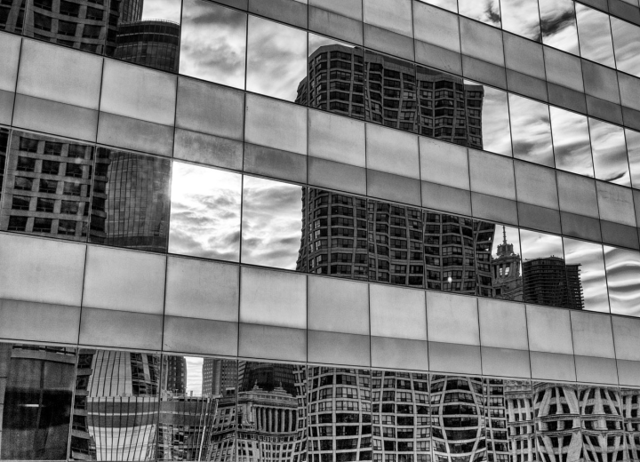
The workflow is pretty simple. Lightroom makes it easy to edit a copy of any old picture in any old external program, so I do basic cropping in Lr, then send it off to Silver Efex. That program has a whole lot of controls and I haven’t taken time to learn them very well, but it’s got a couple dozen presets that were built by people with more visual insight than I’ll ever have, so usually I pick one and go with it. I guess I should have remembered which one this is. Anyhow, after I was done I laid on a teeny bit more Lightroom love. Bits are free-ish so why not be non-judgmental and show you both? I like one of these a lot better than the other, but I wouldn’t expect consensus on the question. Frankly, I have no idea how selling copies of Silver Efex for $149 fits into Google’s business model, but I sure hope we keep doing it. Because B&W is fun, and B&W on steroids is more fun. |
| 12:40 am | 5★♫: Jeff Beck Rock ‘n’ Roll Party I saw the LP on the new-vinyl rack in a record store and was surprised, because I’ve been a pretty big Jeff Beck fan for quite a few years now, but I’d never heard of it. It turns out the Rock ‘n’ Roll Party is a collection of traditional pop chestnuts with a super hot band, not like a Jeff Beck record at all, and excellent. This is happy, happy music. But maybe the YouTube version is all you need. (“5★♫” series introduction here; with an explanation of why the title may look broken.) 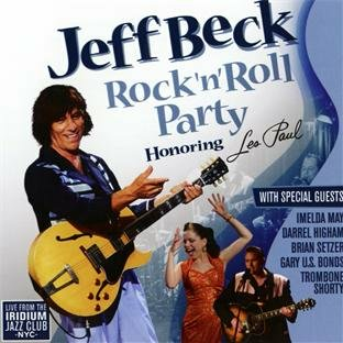
The contextThere’s this jazz bar in New York called Iridium where Les Paul played most Monday nights for the last 13 years of his life, which ended in 2009. This 2010 concert there was billed as “Honoring Les Paul”; most of it doesn’t sound at all like him which is OK as I wasn’t particularly a fan, although I honor him deeply as an inventor of the electric guitar, my favorite musical instrument. The musicI haven’t checked the credits but I’m not sure there’s anything here written later than 1965. The treatments are straight-ahead, fast, 100%-irony-free. I watched the YouTube with my mother, who’s in her eighties and has never really warmed up much to loud-guitar music but still seemed to enjoy this quite a bit. The chief musical flavor is straight-ahead rockabilly, especially as sung by Darrel Higham, who’s British and sounds like it when he talks, but sings like he grew up in the same neighborhoods as Elvis and Jerry Lee. There are pure-fun cameos from Gary U.S. Bonds and Brian Setzer; and if they don’t make you smile you’ve died without noticing it. Darrel’s wife Imelda May sings a lot too and oh my, I’m going to have to check her out. In among the rockabilly is a sequence of Paul/Mary tributes, as in Les Paul and Mary Ford; to achieve the famous multi-tracking effect, Imelda May recorded herself and then sang live with the tapes; really fast and with the band in perfect time; I was impressed. There are instrumentals, and the show ends with a bang: Rock Around the Clock and Shake, Rattle, & Roll. HighlightsImelda May totally lights the place up on on Cry Me a River and (with cheerleading from the band) on Tiger Rag. There is wonderful rockabilly singing from Higham, Bonds, and Setzer. Trombone Shorty tears it up on the Peter Gunn theme and so does Leo Green on sax. But the star is the band; this is an ensemble performance, tight as a drum and sometimes frighteningly fast, with no evidence of anybody breathing hard or having anything but fun. The arrangements are clever too, nothing unconventional but there’s nothing wrong with that. 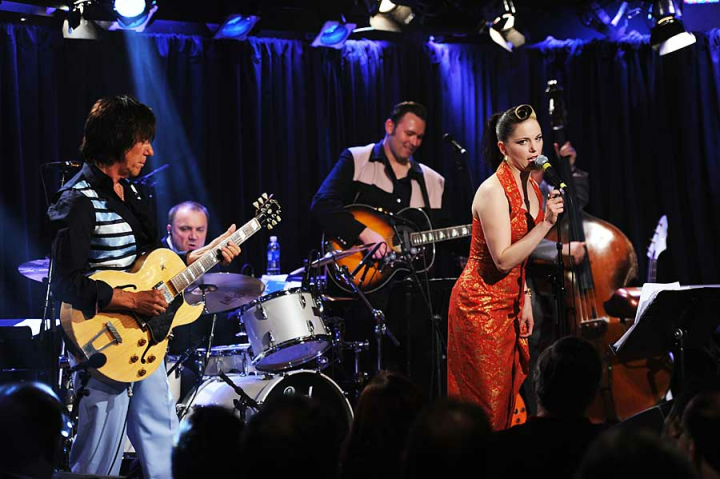
Guitar?Well yeah, Jeff Beck’s name is on the front cover. Yep, he plays really well. Often by getting out of the way, but not always; it’s cool to hear him pushed out of his comfort zone. He rips off surprising high-speed light-weight rockabilly breaks on Cruisin’ and The Train Kept Rollin, and (my favorite bit) plays two surf-guitar instrumentals, Apache and Sleep Walk, straight ahead, very beautifully; some of the shifting chords on Apache will bring tears to your eyes if you care about this kind of music. In a couple of places he digs in and plays actual Jeff Beck Solos, for example on Please Mr Jailer; and then there’s a traditional rave-up with Brian Setzer on Twenty Flight Rock. Happy!The band is smiling all the time while they play and it’s not because they’re trying to sell the songs, it’s because they’re having so much fun. Yeah, the songs sometimes treat of heartbreak but this is pop music and you can have fun with that too. It’s full of smiles. If you have an octogenarian parent, try sharing this with them and they might smile a lot too. Sampling itIt seems to be available in every medium. I bought the LP but don’t particularly recommend it; the sound is only OK and it omits quite a few songs. I watched the YouTube on the big screen via Chromecast with the OK-but-not-great audio and enjoyed it a whole lot more. The sound was convincing, the whole concert is there, and the band is having so much fun you can’t help having some too. |
| Saturday, December 28th, 2013 | |
| 11:09 am | Good Books about Bad Places Christmas was populated as usual with family and food and happiness but this year I was stealing time from them (often sleep time) to read The Orphan Master’s Son. The book’s an explosion of pain and craziness and love and strange, strange flavors, views from angles few could imagine at a place nobody reading it will likely — thank goodness — ever see. It dwells amid the horror of the Kim dynasty’s dystopic North Korea; which in my case is a little weird, because the only other book that’s hit me this hard in recent years is Dogs at the Perimeter (more here), rooted in the Khmer Rouge “Year Zero” ravaging of Cambodia’s luckless people. I seem literarily drawn to the bad parts of East Asia. Tl;drThe Orphan Master’s Son is in two parts, both about the same North Korean man but with two names. In the first he lives through some of the terrible things you’ve heard about that terrible place, and does some of them; the action in the second shifts to the circles of power and terror surrounding the Dear Leader i.e. the late Kim Jong-Il. The second half is phantasmagorical; the first gritty. Author Adam Johnson made a research trip to Pyongyang and, while nobody would call him a North Korea wonk, the real North Korea wonks who reviewed the book were pretty impressed at his capture of the place. Well, in the first half anyhow; once you’ve got Dear Leader playing a role you’re on unknown territory, because nobody really knows much about life in the inner circles. What’s goodThe writing is just amazing, effortlessly flavorful; it’s impossible not to feel that You Are There, and impossible not to care about the people in the grip of the North Korean murder machine. It’s a big book, but doesn’t drag, not once not ever, oh no. And some of the plot twists will yank you sideways at twelve G’s without even requiring too much suspension of disbelief. What’s badNorth Korea; its continued existence constitutes a moral failure in the leaders and citizens of the countries that surround it. Any accurate picture you draw of it is gonna be repulsive, obviously; and this is. The details of what starving people eat to live will revolt you, and the details of what happens to people starved systematically of love are worse. But it’s still a good book about a bad place. There’s a pattern hereI’ve also recently enjoyed and recommended the Inspector O novels, another work painted on a North-Korean backdrop. I suppose it shouldn’t be surprising that places which are repulsive, irrelevant to almost everyone, and hard to find about should serve as muses for really fine writers. |
| Monday, December 23rd, 2013 | |
| 11:42 pm | More Things About TV Wow, when I asked Is 4K BS? three days before Christmas, I didn’t expect much of a reaction, but is that little piece ever popular. A bunch of useful follow-ons appeared in the comments and on G+ and Twitter, so here they are. And everyone agrees: The biggest problem with TV isn’t the pictures, it’s the shows. Which is a little weird, because we are also generally agreed to be in TV’s golden age. But still, lots of times when I feel wiped and want video wallpaper, nothing’s on. |
| 1:40 am | Is 4K BS? I hear that Sony & friends are going to start telling us that our HDTVs aren’t good enough and we all need to upgrade to 4K (which is twice the dimensions and 4 times the pixels of 1080p). NBC news says the experts are unconvinced, and quotes one of them: retina scientist, photographer, and blogger Bryan Jones. I thought I’d do the numbers and yeah, I think it’s probably BS. [Update: Wow, this piece touched a nerve and generated a ton of interesting follow-ons, which I wrote up in More Things About TV.] In Jones’ widely-quoted piece Apple Retina Display, he argues that the literature shows the human eye has an angular resolution of about an arcminute (1/60 degree). So, sitting in front of an NFL game, it occurred to me to wonder how far apart, in arcminutes, the pixels in my TV are. Let’s call Arc-Minutes per Pixel AMpP for short, and if it’s less then 1, that should mean that our eyes can’t distinguish pixels, which is the goal. I’ve got a 42" screen and sit 7½ feet from it. Per this TV Size Chart, its height is 20.6 inches, and the total angle subtended, assuming my eye is somewhere near the vertical middle of the screen (this is all in radians): angle = 2 × arctan(height/2, distance) Then of course the AMpP is: (angle / resolution) / (π / (60 × 180)) Which I think the following chunk of Ruby does. If I have the math right, then from where I sit, on my TV, my AMpP is 0.73. Yay! But my 42" set, as big as we can fit in our video cave, is hardly state-of-the art. There’s a suggested-TV-size calculator at HDTVtest.co.uk, which suggests that a real video weenie ought to have a 55" screen at 7½ feet; which gives you around 0.95 AMpP. Hmm, I bet the math behind that site is designed to make the AMpP come out around 1.0. At my distance, I’d need a 60" set before the AMpP hits 1.0 (at which point I’d be worrying about brain damage). So my take-away is that the 1080p TV standard is a pretty good match for our eyes. The experts in the NBC article at the top suggest TV designers should worry more about color accuracy and dynamic range. I think a much bigger problem is that there’s often nothing on worth watching. [Thanks to Bryan Jones for glancing at my math. He made a bunch of good points that deserve space of their own; I hope he writes them down.] |